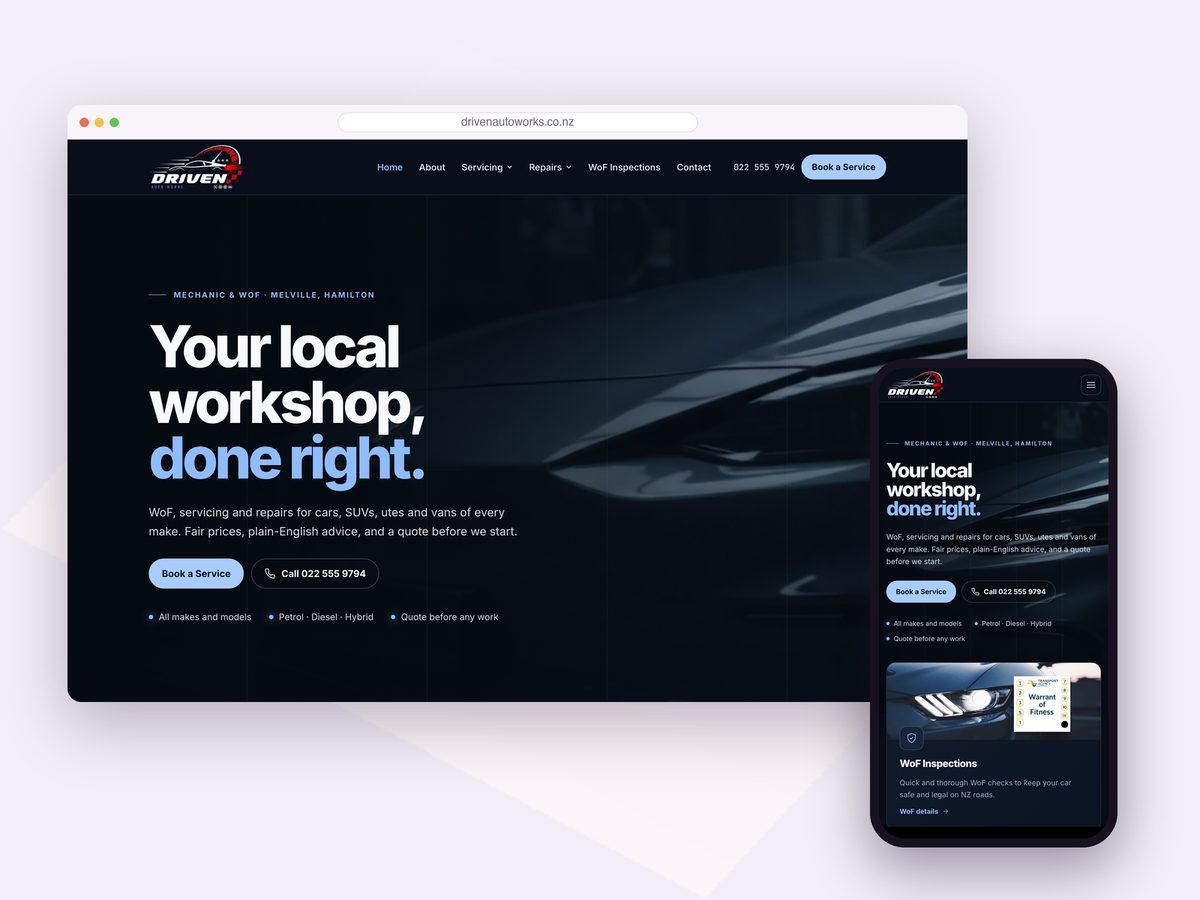
Brand & DesignIT ServicesDigital Media
Pixignite Solutions
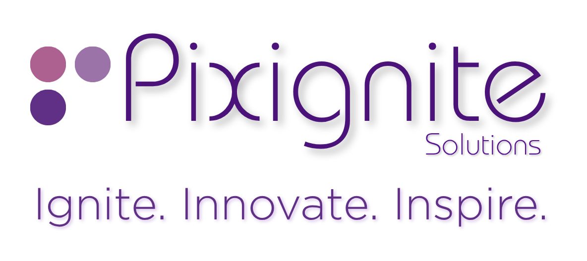
Our own brand. Three studios under one name needed one mark that works everywhere: a logo with three dots, one for each studio, and a colour for each dot that we carry through the website, social media and everything we make.

The brief
Pixignite brings three studios together: IT Services, Brand & Design, and Digital Media. The brand had to show that range in one simple mark, look at home on a phone screen and in print, and give each studio its own colour without breaking the whole.
The name joins pixel and ignite. A pixel is the smallest piece of everything digital; to ignite is to set something going. That is the work: we take small pieces, an idea, a logo, a line of code, and spark them into websites, brands and screens that move a business forward.
The mark
- Technology IT Services · #602c84
- Brand Brand & Design · #a8608e
- Media Digital Media · #9c74b0
- The open corner Room for new directions
What we did
Brand & Design
Logo
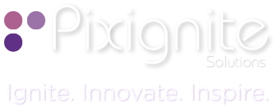
The three-dot mark with the Pixignite wordmark and “Solutions”, in a version for light backgrounds and one for dark.
Colour palette
One colour per studio, plus a deep purple for buttons and a plum for dark areas.
- IT#602c84
- Brand#a8608e
- Media#9c74b0
- Accent#4a1478
- Plum#2a1240
Tagline
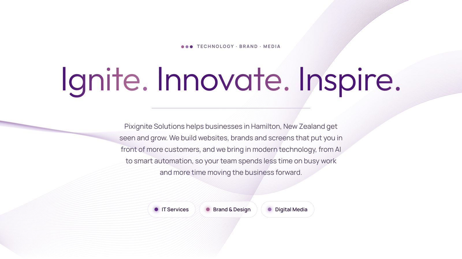
“Ignite. Innovate. Inspire.”, with “Technology · Brand · Media” as the line under it.
Typography
Outfit for headings and Manrope for text on the website.
Icons
The three dots on their own as the browser icon and the phone home-screen icon.
Stationery
Coming next: business cards, a letterhead and an email signature in the same system.
Digital Media
Social share image
The image that shows when pixignite.co.nz is shared, built from the logo and the website’s silk wave.
Facebook cover
A cover photo and a looping cover video made from the website’s hero, so the page and the site look the same.
IT Services
Website
This website: the brand colours, the dots as the loader and studio markers, and a live silk-wave background.
 16 px32 px
 App icon
Results
- 3 studiosOne mark, with a colour for each studio.
- 1 systemThe same dots and colours on the website, icons and social images.
Services used
BrandingWebsite developmentCorporate advertisements