Brand & Design
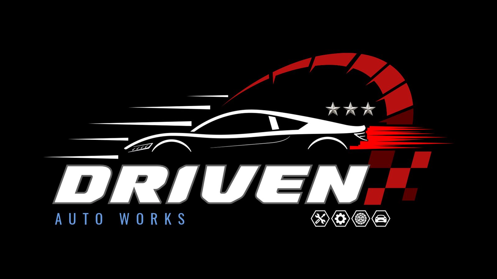
Driven Auto Works logo
Driven Auto Works already had a logo, but wanted a new, more professional one. We designed it first, before the website, so everything we made for the workshop afterwards could be built around it.
The brief
Driven Auto Works is an auto workshop in Melville, Hamilton. They had a logo, but wanted to replace it with a new one that looked more professional.
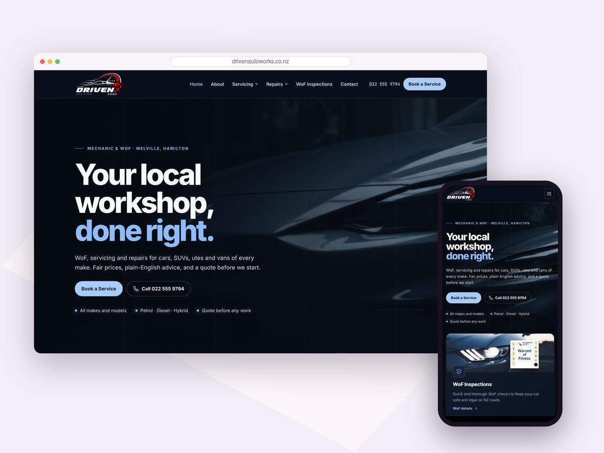
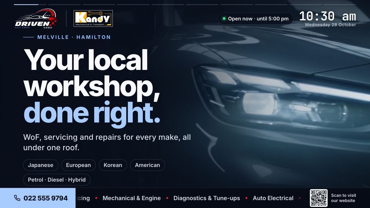
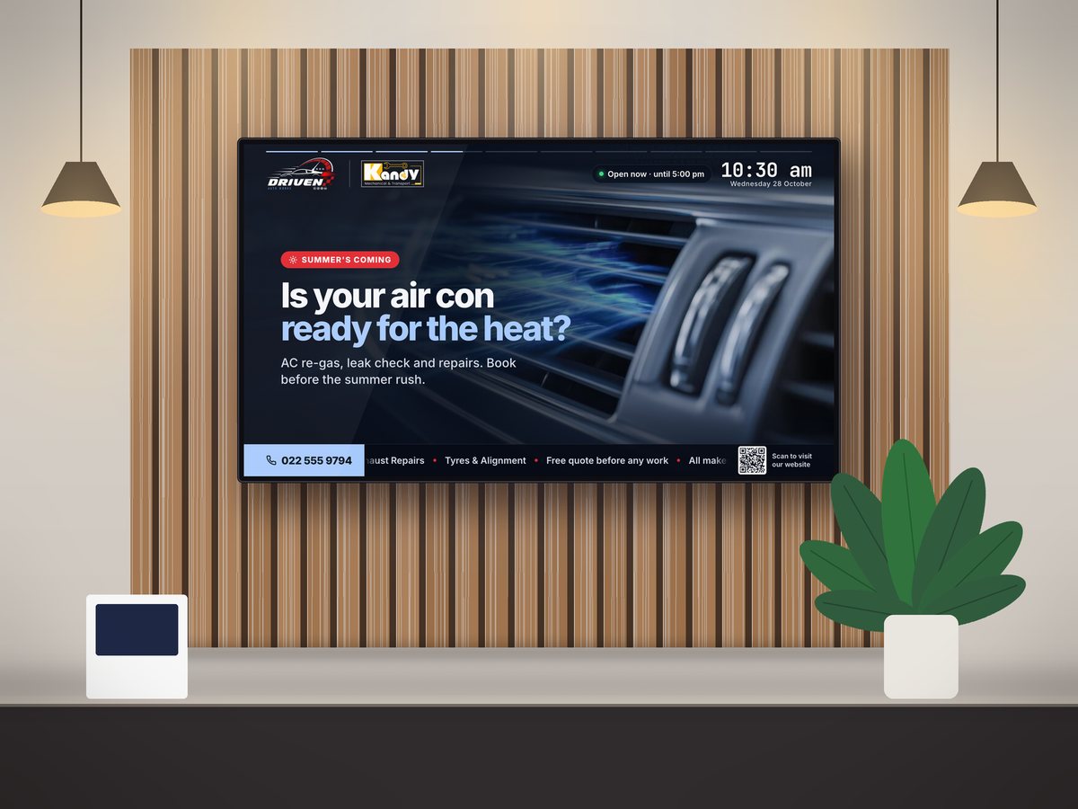
The logo came first. Once it was done, we used it as the starting point for the workshop’s website and waiting-room screen, so every piece shares the same look.
What we did
Brand & Design
Logo mark
A white sports car with speed lines, set against a red rev-counter arc, with three stars and a red chequered flag.
Wordmark
“DRIVEN” in bold, slanted letters with a steel-grey outline, and “AUTO WORKS” in widely spaced blue capitals underneath.
Service icons
Four hexagon icons built into the logo for the workshop’s work: tools, a gear, a brake disc and a car.
Colour palette
Reds, blue and steel grey on black, taken from the logo.
- Red#b71010
- Signal#ff0000
- Maroon#580000
- Blue#669be1
- Steel#616161
Where it’s used
- The header of drivenautoworks.co.nz
- Every slide on the waiting-room TV
- Signage and vehicle graphics
- Printed material and uniforms
Services used
Branding